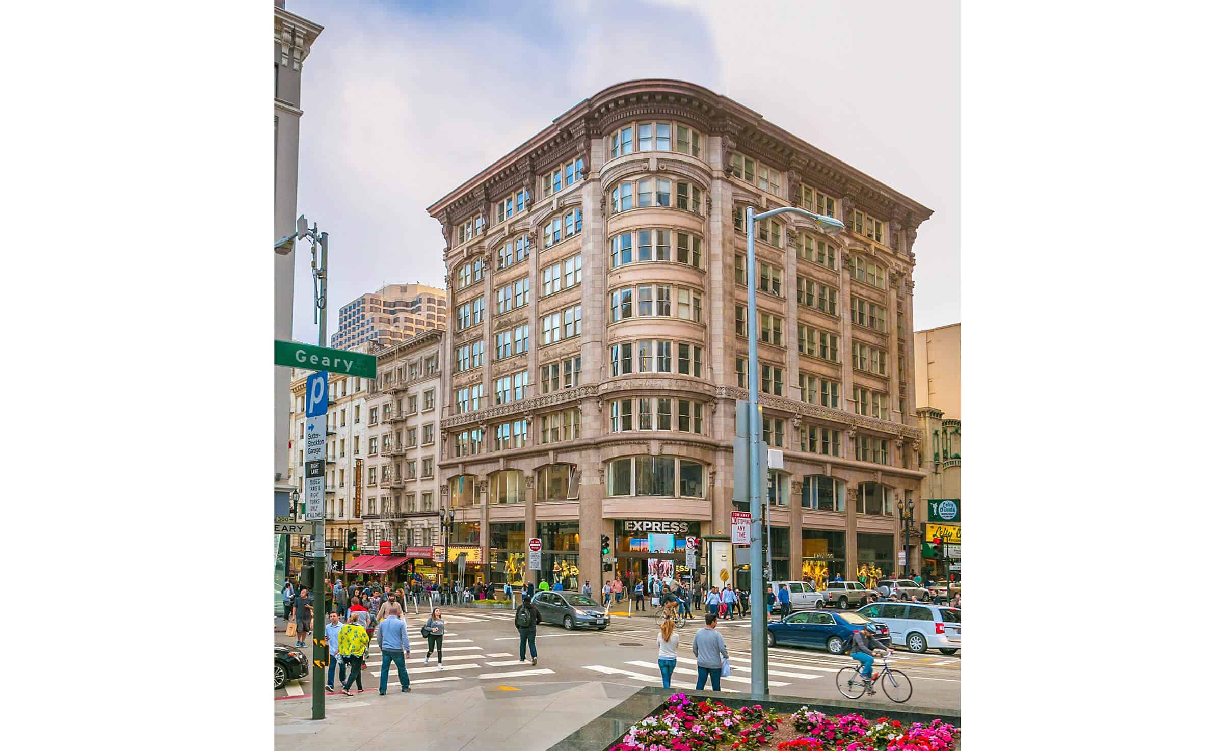

323 Geary
The Elkan Gunst Building
For more than 20 years, FENNIE+MEHL has played the part of an embedded business and design partner by delivering building repositioning and shell & core projects for visionary building owners, developers, and redevelopers.
But for real estate investors, developers, and owners specifically, the studio will integrate its design approach with data-backed feasibility, due diligence studies, and early market analyses. Such deep insight helps drive a client’s long-range strategic planning and thinking for their built investments, while validating the value of the proposed scope prior to beginning renovation work.
F+M applied this systematic due diligence to 323 Geary Street on San Francisco’s Union Square, part of The Handlery real estate portfolio. Built by architect Albert Lansburg for tobacco businessman Moses Gunst and named in honor of his son, the eight-story Elkan Gunst commercial building was completed in 1908. When F+M met the Handlery organization, the Elkan Gunst building clearly exuded an impressive historic exterior, yet the interior was tired, compartmentalized, and awkwardly laid out. It also had an outdated HVAC, structural, and elevator system.
The owners’ vision was to revitalize the underutilized building to its former glory, while also repositioning its curb appeal toward modern, world-class businesses and tenants. F+M devised a strategy to reinforce higher rents and asset longevity to appease investors, as well as reinforce the safety and experience of the building to appease tenants.
Thinking like a developer business partner, F+M crafted a market vision for 323 Geary that consisted of an upscale office building with Class B leasing standards. The idea was to transform the small, inefficient tenant spaces used by travel agencies, hair salons, and professional services accessed from a narrow corridor to full-suite-sized floors that embrace modern standards for collaborative, large-scale office environments. This is one example of how an architectural decision is both design-forward (open, flexible spaces serving the needs of today’s remote hybrid workforce) while also making business sense (leasing an entire floorplate or buildings are much more desirable to landlords than subdividing space). Exterior improvements and lighting would extend the beautification benefits to the community as a whole.
F+M assembled and lead a multi-disciplinary team that analyzed the renovation design and engineering process from all angles: Plant Construction as general contractor, Murphy Burr Curry as structural engineering, Glumac as MEP engineer, HLB as lighting designer, VDA as elevator consultant, MK Equities and Urban Real Estate Advisors, and A.R. Sanchez-Corea & Associates as permit and code consultant.
F+M’s experience with historic building renovations and San Francisco city personnel helped streamline problem solving on the building’s exiting requirements. Creative solutions were agreed to in pre-application meetings with the building and fire departments to maximize the likelihood for cost-effective renovation approvals.
F+M coordinated the creation of a pro forma with their real estate advisor to vet the diligent pricing and schedule studies from the general contractor. The pro forma helped demonstrate the immediate value-add to the building asset, which gave the owner leverage to budget for premium rental pricing. F+M’s final report issued to the Handlery organization reinforced that the cost of the renovation and repositioning project would be fully paid off in approximately seven to nine years.
The due diligence, feasibility studies, early market analysis, programming, and pro forma were made into a three-volume document that guarantees the decisions will be understood even as key leadership changes within an ownership. F+M wants to help their client’s make decisions that are backed by hard data to help create more predictable outcomes and reduce uncertainty.
Existing building renovations can be relatively unpredictable and require a certain amount of agility and communication to execute successfully. A historic building, such as the Elkan Gunst, requires even more special care. The thoughtful design charettes and thorough due diligence, combined with detailed budgets and schedules that FENNIE+MEHL partnered with us on, helped make a clear case that the Elkan Gunst repositioning project was not only beneficial for the Owner’s tenants, but the investment would also prove to be a valuable business decision for the Owner.
Greg Bonderud, VP, Plant Construction
Artist renderings: FENNIE+MEHL
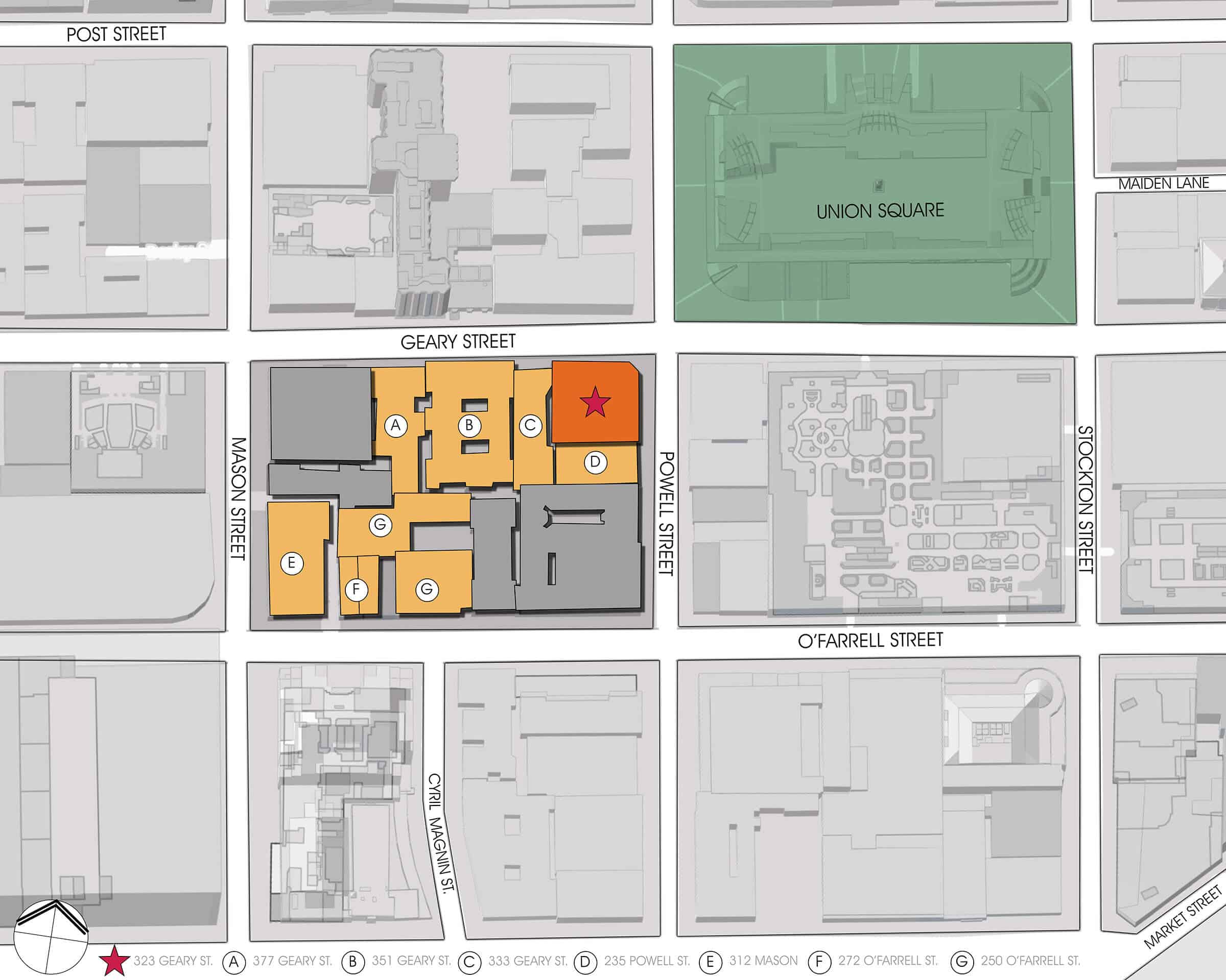
Once the owners of 323 Geary were shown this level of business and design thinking, FENNIE+MEHL was engaged to complete feasibility studies on seven other properties in the surrounding Union Square neighborhood, shown above.
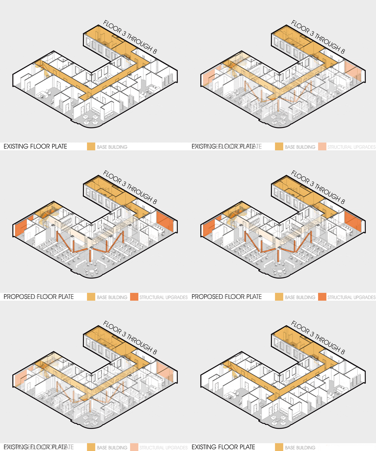
The animated gif above shows how the proposed upgrades transform the existing conditions of a typical 323 Geary Street floorplate. Proposed upgrades included a renovated historically significant ground-floor lobby, a restored exterior façade and exterior accent lighting to focus attention from passers-by, full-floor tenant suites to attract world-class companies, reconfigured exit stairs for fire-rated and accessible means of egress through the space, modernized elevators, structural improvements, and HVAC upgrades.
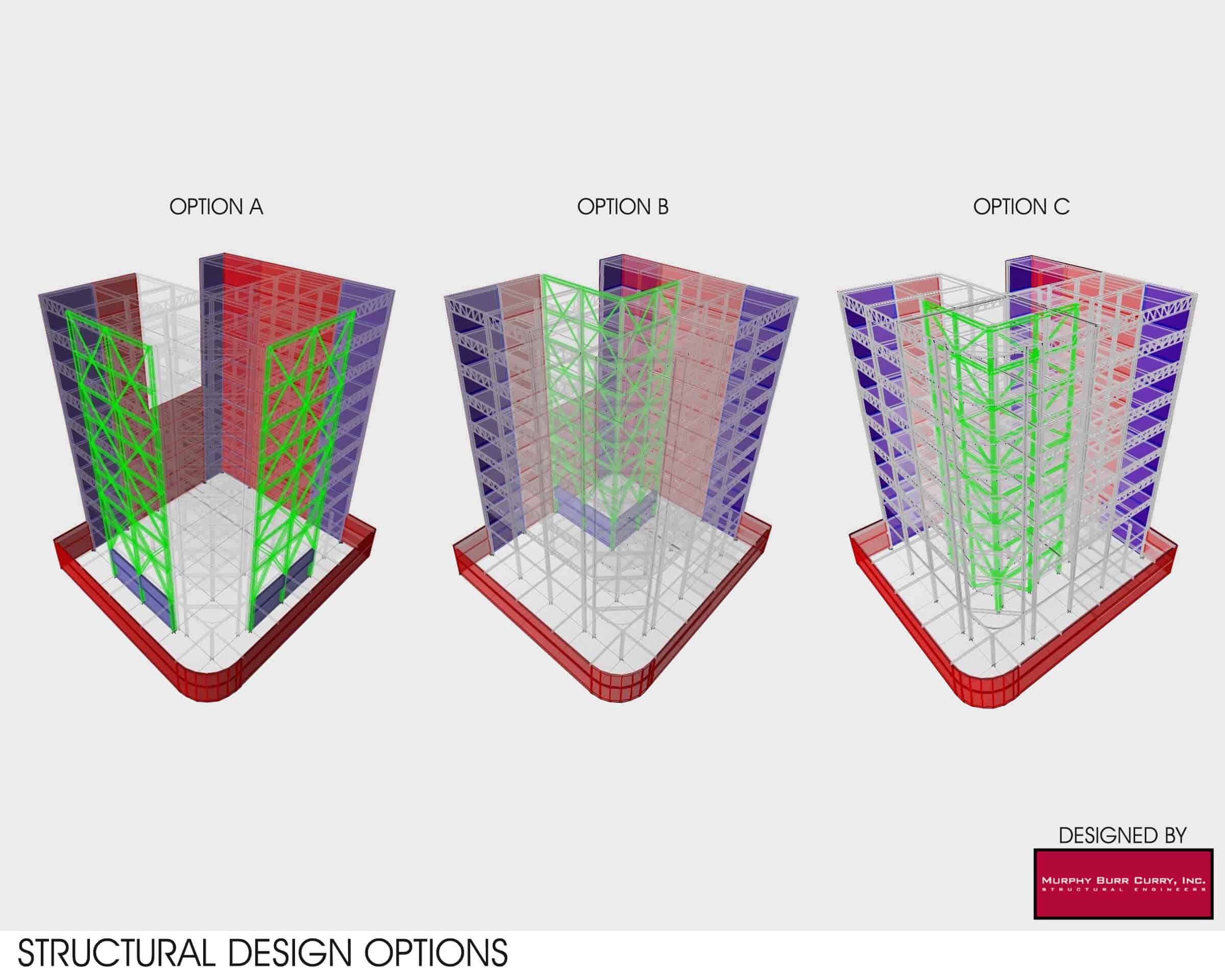
FENNIE+MEHL partnered with Murphy Burr Curry to present (3) design options to the client developed in ETABS structural analysis software. All (3) models factored in shear walls along the (2) solid walls at the rear of the building. The (3) options demonstrate (3) different steel brace locations – either located at the street-facing façades, at the rear walls surrounding a lightwell, or in the middle of the floor plate. FENNIE+MEHL ultimately recommended placing the brace frames in the middle of the floor plate in order to avoid seeing the structural elements from the street or reducing daylight entering the lightwell in the rear.
